
The HTML5 Texas 2013 Conference was great! Here are notes, slides and other resources I collected.
My blog posts of sessions that I attended.
- HTML5TX 2013
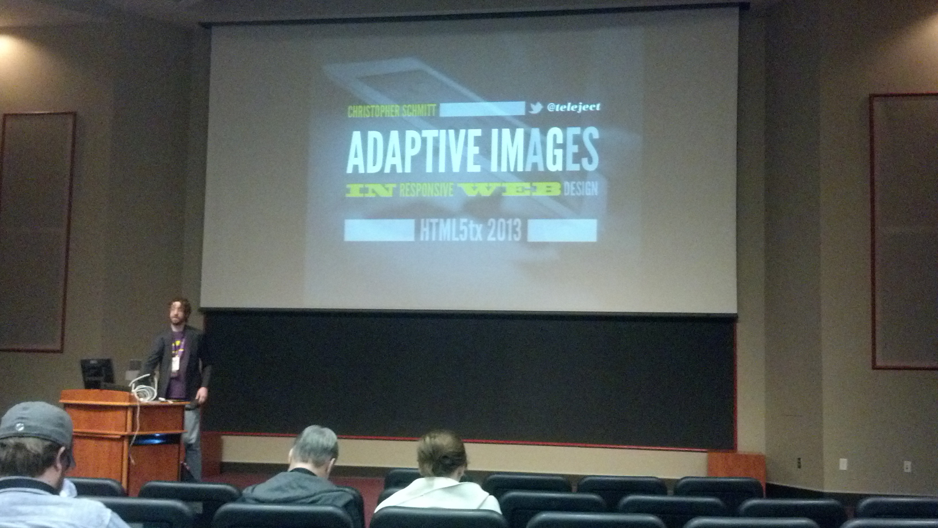
- Adaptive Images for Responsive Web Design
- Backbone: 3 Ways
- Managing a Large Front-End Project with Automated Build Tools
- You Got your MVC into my Components: Adding Bindings to Enyo
- 10 Things You Didn’t Know a Browser Could Do
- Front End Legos
- Model-View-Websockets
- Rapid Templating: “Designing in the Browser” with Sass, Compass, and Serve
- Closing Panel at HTML5TX Conference
JavaScript Workshop by Pamela Fox


